CARBONE’S PIZZA BAR & GRILL
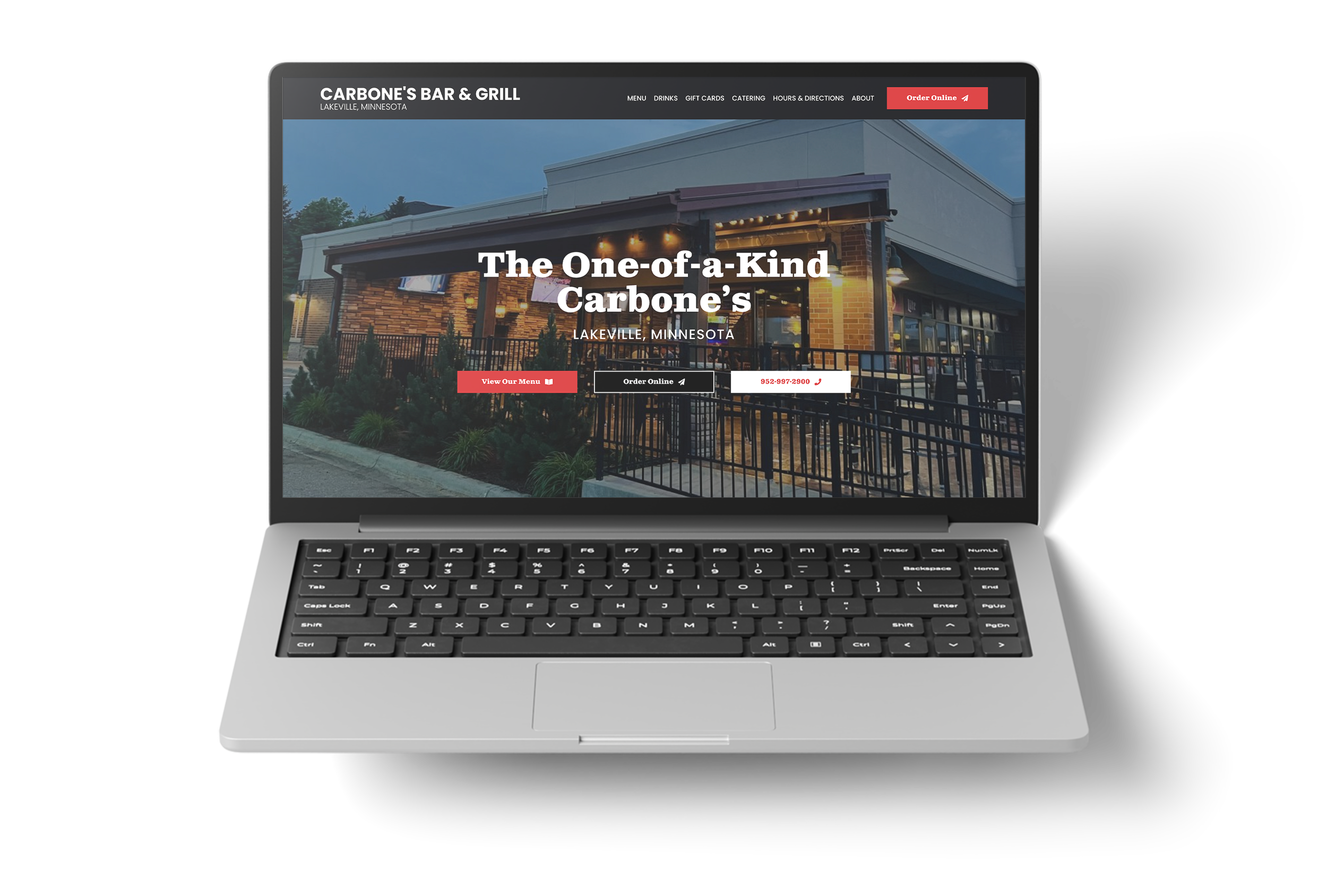
Carbone’s Lakeville has a name problem that most restaurants would take in a heartbeat: the name is already famous. Carbone’s is a Twin Cities pizza institution, and the Lakeville location has carried the name since 2002.
The catch is that the Lakeville location is not the same restaurant. It runs its own kitchen. They hand-cut the meats and fries, slice their own vegetables, make the crusts and sauces from scratch, and get the Maytag Blue from a small dairy in Wisconsin. As they put it, they are like no other restaurant in the Twin Cities, not even any other Carbone’s.
So the site had to do two things that pull against each other. Borrow the pizza reputation the name carries, and separate from it. All while staying out of the way of the person who pulled up the site in a parking lot at 8:45 on a Wednesday and only wants to know if the kitchen is still open.
The Creative Depot built carboneslakeville.com around what people actually open a restaurant site to do: check the menu, check the hours, order. Everything else earns its place around those three.
1. The menu on the page, not in a PDF
Most restaurants publish their menu as a PDF. It is hard to read on a phone and search engines can do very little with it. Carbone’s menu is real text: every item, description, and price across appetizers, salads, wraps, pasta, pizza, sandwiches, hoagies, and kids. Jump links across the top let someone skip to pizza without scrolling past wings.
The knock-on effects matter more than the page itself. Prices update in minutes instead of a design round trip. The page reads well on a phone. And the descriptions are crawlable, so when someone asks Google or ChatGPT what Carbone’s serves, the answer is on the page instead of locked inside a file.
2. Hours the way the restaurant actually runs
Hours are split by kitchen and bar, day by day. The kitchen closes before the bar. Pizza runs later than the kitchen on Sunday and Wednesday. Bingo is Tuesday at 6:30. Delivery starts at 11 daily. Most sites flatten all of that into one line, and every customer who reads it gets it wrong at least once.
3. Ordering within reach from anywhere
Order Online sits in the sticky header and in the hero, on desktop and mobile. The phone number is click to call. Get Directions opens Google Maps with the address already loaded, and a map embed shows the corner at Cedar and 160th for people who want to see it before they commit.
4. Catering as its own path
Catering has a dedicated page and an inquiry form that asks what the kitchen needs to quote: headcount, date, location, and details. That replaces phone tag with a submission that arrives ready to work.
The site answers the three questions a customer shows up with, in the order they ask them. The menu is readable on a phone and it is current, because changing a price takes minutes instead of a design round trip. The hours say what the kitchen is doing and what the bar is doing, separately, so nobody drives out to a closed kitchen. Ordering is one tap from any page and the phone number dials itself.
The About page does the slower work. It separates the Lakeville location from every other restaurant carrying the Carbone’s name, and it puts the scratch-kitchen story somewhere permanent, backed by the restaurant’s own photography rather than stock. That is the part that turns a first visit into a habit.
Catering runs on its own path. Inquiries arrive with the headcount, the date, and the location already attached, which means the kitchen can quote instead of calling back to ask.
The structure also holds up. A menu written as text instead of locked in a PDF stays current with almost no effort, and every item on it is readable by Google and by the AI engines people are starting to ask where to eat. Twenty-four years on the same corner, and the site is built to keep pace with the kitchen.
“”
Want results like these? It starts with a thirty-minute strategy call. No pitch deck, no pressure, just a conversation about what your site should be doing.
START YOUR STORY →